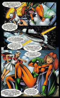
Yes, because Awesome is going to pay two artists to do the same script on purpose!
Anyway, Checker ended up lettering Morrigan's artwork and running it in their collections in place of Gebbie's. I prefer Morrigan's, as I think he has an excellent handle on how to illustrate Suprema's out-of-time personality and the modern style works better than Gebbie's more classical style. (The opposite will be true when we get to an issue of Glory much later on.)
Also, this is the last time we'll see Morrigan's art both in the pages of Supreme and in comics in general, as after this, he disappears, never to be seen again.
It's also interesting to note Gebbie's take on Suprema's uniform, with the bracelets, and how that is what Suprema's uniform was originally supposed to look like. We've been through so many different designs on her uniform through all the different artists that anything that is close at this point is good enough.
So here are the two versions, side-by-side:


I think I prefer Gebbie's work here, honestly. Revisiting Morrigan's work, it's not as bad as I remember when I first read through Moore's Supreme run, and I agree that he has a nice handle on Suprema's expression, but the over-the-top T n' A puts me off (the fact that he starts off with a patented comics "brokeback" pose doesn't help). Gebbie is no stranger to kinkiness and sexuality of course, and while she definitely plays up the "girlfight" undertones, it's a more subtle form of eroticism than Morrigan's stuff, which just feels like a fourteen year old boy alone in his room. It also reminds me of the time in comics where, any time a woman wore a skirt, pretty much every panel had a convenient draft of wind to show a gratuitous panty shot.
ReplyDeleteGreat blog, by the way! I've been going through it the last few days -- it's like it was written just for me.
That’s a good call on Morrigan v. Gebbie, even if I disagree. For me, Gebbie was too avant-garde for Supreme. It was just too much to flow from Veitch to her to Sprouse. That said, I loved her work on Glory, where the style worked perfectly for the flashbacks.
DeleteMorrigan was definitely one of those ‘90s artists drawing women in a way that would be unacceptable today, he still got a lot of the nuances right, from Suprema’s giggles to her stern glare. When I think of Suprema, it’s usually his Suprema that I think of.
There also weren’t many great artists that were on Supreme until Sprouse showed up, so someone who was mostly competent like Morrigan seems much better than he was.
As for the panty shots, Moore actually wrote them into the scripts. So it wasn’t only the artists of the ‘90s doing it.