I'll reference him again as we go on, but here are some of his contributions to Supreme #41 and how he helped capture the exact retro feel that made the book such a loving homage.
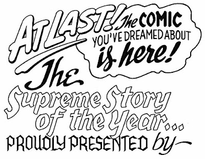
As I mentioned in my weekly reading, the credits page helped set the tone for the issue that followed. Klein created it, as he explained on his blog:
It makes sense that Klein was modeling the design on Ira Schnapp (who created logos and lettering for DC Comics from about 1940 to the late 1960s) as Moore and company were creating a love letter to the comics they grew up with."Hand-lettered rather large in the style of Ira Schnapp, this appeared on the inside front covers of SUPREME #41-52 and served as the ongoing story title for those Alan Moore-written issues. I no longer recall who suggested going this route, but it was probably Alan. I think I was the one who found appropriate old DC Comics house ads to imitate, pulling ideas from several of them. Scanned from the original lettering in my files. Lots of other Ira Schnapp and Gaspar Saladino lettering homages appeared in the issues."
Some more pieces of lettering from this issue, from another blog post:
"When I was lettering the Alan Moore issues of SUPREME, whenever I did some hand-lettering I thought I might want to use again, or at least refer to, I made a photocopy. My copier wasn’t the best, and sometimes, as above, the copies were dodgy, but good enough for reference."
"This one I copied in case I had further use for this style for Squeak the Supremouse. The sound effect was a bonus. Leave it to Alan to sum up what I loved about super-animals like Mighty Mouse as a kid in one choice panel!"


No comments:
Post a Comment